YMCA Brand Positioning
YMCA of the North (YOTN) is a top three YMCA in the United States and top five in the world. This status creates a lot of visibility and sets an expectation of leadership. The YMCA’S federated model also sets expectations about how we present ourselves. Our task was navigating the space between highlighting YOTN’s unique characteristics and maintaining compliance with national brand guidelines.
Part One: Pre-Positioning
In strategy, voice, and vision, the foundation for our brand repositioning campaign (part two) was built through the time, trial, and adjustment we put into determining what works (and how it works together).
Brand Compass and Website Transformation
Originally tasked with transforming a huge website with limited resources, we knew to ‘eat the elephant one bite at a time.’ We also knew that YMCA of the north serves four distinct audience segments — camps, child care, fitness, and social services — each competing in a unique industry. So, to help us navigate this challenge, we developed the brand compass, which evolved to show four doors leading to one YMCA grounded in community and whole-person wellbeing.
Like siblings, the four subsites express distinct qualities within a common design. The most noteworthy device being the use of color, (to help users distinguish between program areas) and color bands (to symbolize the bonds between them).
YMCA of the North industry alignments
Program area websites
Five Dimensions of Wellbeing (5DoW)
We created and developed Five Dimensions (and a curriculum to support them) as part of the George Wellbeing Initiative, which brings an integrative health approach to the Y. This concept ultimately inspired our BHAG to become ‘the leader in wellbeing experiences for individuals and communities,’ which is also reflected in the brand compass.
5DoW graphics and curriculum
Studio door graphics (with first-generation graphics)
Additional Materials
The compass concept and color treatments, along with the Five Dimensions of Wellbeing, were applied to strategic materials as we laid the groundwork for (and tested) a promised brand repositioning campaign. Some of my favorite examples include the Virtual Y studio doors (above) and Letters From Camp Magazine (below).
Part Two: Re-Positioning
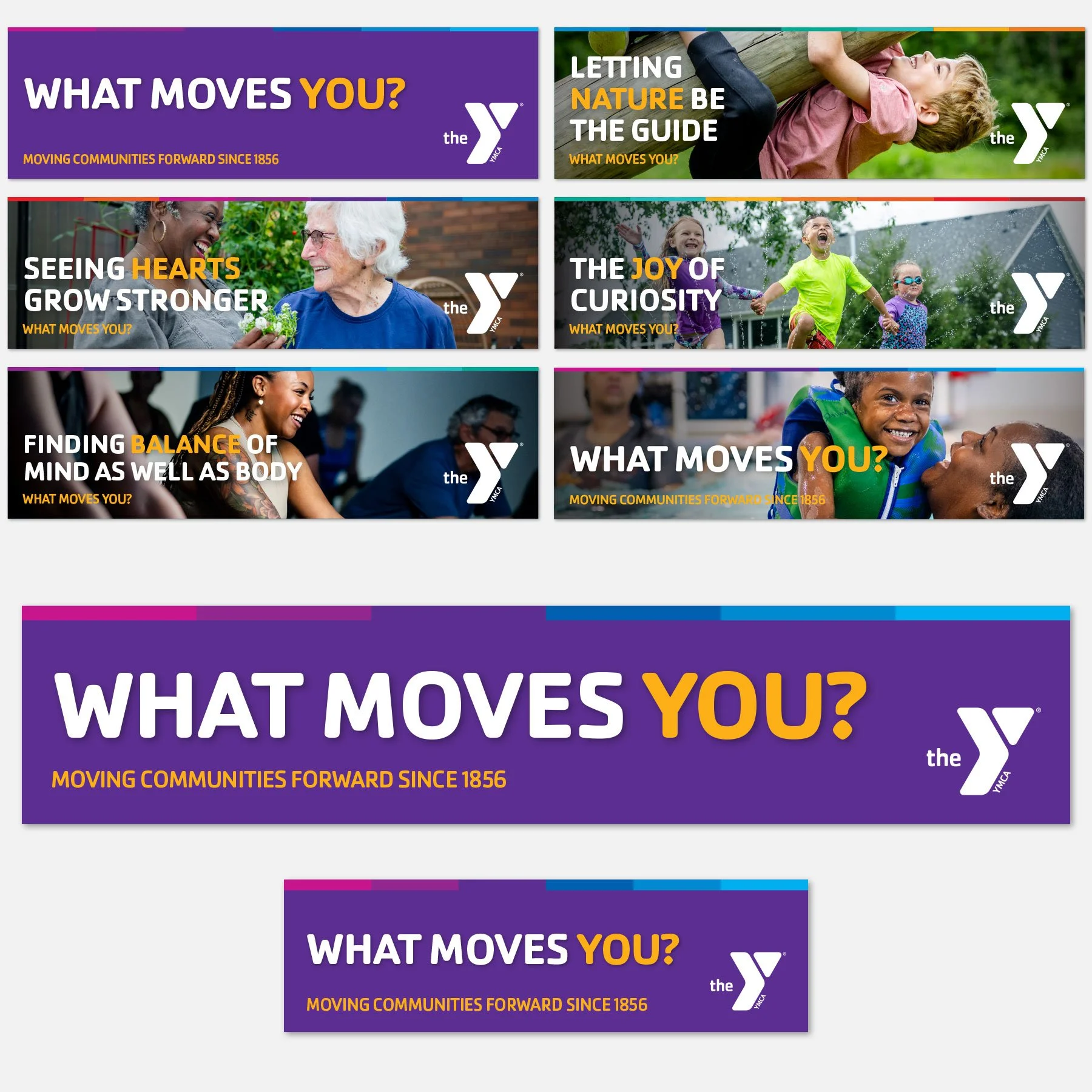
The official brand repositioning campaign for YMCA of the North is the capstone for all the work leading up to it, including website transformation, brand pre-positioning, and Virtual Y. Like our Virtual Y campaign, the ‘what moves you?’ messaging puts the focus on the customer’s experience, which is grounded in joy and the sense of community YMCA’s are known for creating.
Design-wise, care was taken to ensure that messaging is complimented by the use of our program area colors and united with ‘gold’ accents. The copy is set atop color fields or full-color photography to create everything from in-branch materials to outdoor graphics and beyond.
Campaign Guidelines
In-Person and Oversized Graphics
Display Ads for TV and Equipment Monitors
Digital Marketing Graphics
Google Ad
Billboards and Bus Graphics


