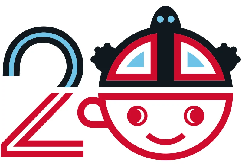
Anniversary Logo
In 2016, Peace Coffee celebratd 20 years of Fair Trade coffee leadership. As part of its celebration planning to take place over the course of a year, Peace Coffee wanted to created a 20th Anniversary graphic to tie everything together.
Challenge
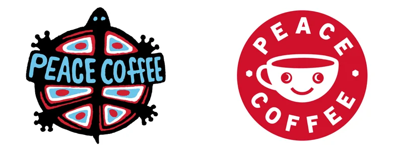
Peace Coffee has two relatively distinct identities – one for their CPG coffees and one for their coffee shops. The former is represented by a distressed turtle logo, while the latter is represented by a stylistically clean smiley-face mug.
Process
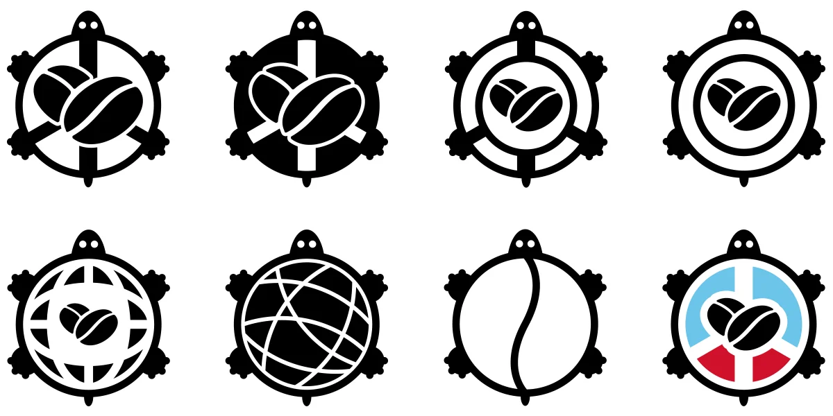
In our search for common ground, we explored several ways to reimagine both identities – independently and in tandem. In the process of creating the 20th anniversary logo, we also developed an alternate turtle graphic that replaced the 'Peace Coffee' text with a pictogram treatment.
Solution
The final 20-year logo is a mash-up of both logos, with the turtle set inside the mug to form a ‘zero,’ which is then set behind a stylistically similar ‘2.’ We also found a beautiful, geometric font to compliment the logo and create a more complete visual brand identity for the campaign.